Design
Design sets the look of your whole Calling Card at once. Not one page, not one block: the fonts, the colours and the spacing of every page, from a single panel, with your real pages updating as you choose.
Opening Design
Click Design in the editor's toolbar, the row of actions under Published.
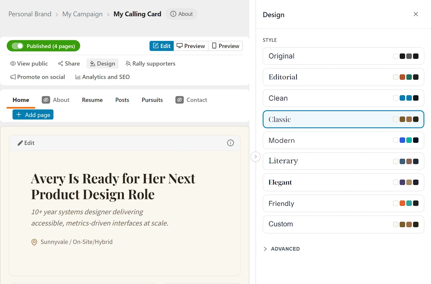
The panel docks to the right and the page makes room for it, so you are looking at your actual Calling Card while you style it, not a mock-up of one. Everything you pick applies immediately and saves itself. A small Saved marker next to the panel title confirms it landed.
Switch tabs while the panel is open and the new page is styled too. Nothing here is per-page.
Styles
A Style is a complete look: a heading font, a body font, sizing, spacing, and a full palette. One click sets all of it, which is the point. A palette fighting the fonts is the usual way a page ends up looking wrong, so a style never leaves half the previous look behind.
| Style | Character |
|---|---|
| Original | Black and white, clean sans. The classic Calling Card look, and the default |
| Editorial | Warm off-white with a serif headline. Reads like a magazine feature |
| Clean | One sans throughout, generous space, nothing decorative |
| Classic | Serif headlines over a workhorse sans. Traditional and formal |
| Modern | Geometric headline sans, tight and current |
| Literary | Bookish serif headings with a plain body. Quiet and considered |
| Elegant | High-contrast display serif with a soft sans beneath it |
| Friendly | Rounded, approachable sans at a comfortable size |
Each card shows its palette as four swatches, and its name is set in its own heading font, so you can judge it before you click it.
Custom
The last card in the list is Custom: your own look, kept separately from the styles.
Once you change anything by hand, Custom becomes the selected card and holds what you built. Try a style afterwards and your custom look is not lost: click Custom again and it comes back exactly as you left it.
Clicking Custom when you have never built one selects it and changes nothing, so it is always safe to press.
Advanced
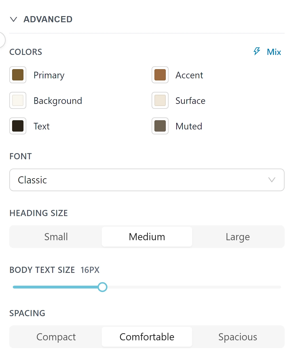
Advanced opens the individual controls behind a style. Touch any of them and you are on Custom.
Colours
Six colours do all the work. Hover any of them for a reminder of what it drives.
| Colour | What it drives |
|---|---|
| Primary | Clickable things: links, buttons, the navigation underline |
| Accent | Decorative highlights: eyebrows, stat numbers, bullets, emphasised words in a headline |
| Background | The page background |
| Surface | Cards, borders and dividers |
| Text | Body text |
| Muted | Secondary and quieter text |
Mix rolls a coherent random palette from a single base hue, kept inside safe lightness bands so your text stays readable. Press it until something catches your eye, then adjust from there.
Font
A pairing sets the heading and body faces together. The pairings are curated, so any of them will hold up next to each other.
Heading size
Small, medium or large. This scales headings only, independently of body text, so you can have big statements over normal prose or the reverse.
Body text size
The base size everything else is measured from. Moving it moves the whole page in proportion.
Spacing
Compact, comfortable or spacious. This is the line height and the rhythm between blocks: how much air the page has.
Seeing It Properly
The editor shows your blocks in tiles, which is useful for editing and slightly misleading for judging a design. Switch the toolbar to the desktop Preview to see your Calling Card in its real chrome, with the header, the navigation and the footer, exactly as a visitor gets it. The phone Preview does the same in a phone frame.
Design stays open while you do this, so you can keep adjusting.
Tips
Pick a style before you adjust anything
Start from a complete look and change what bothers you. Building a palette from scratch on top of default fonts is how pages end up incoherent.
Two colours matter most
Background and Text decide whether your Calling Card is comfortable to read. Get those right and Primary and Accent are decoration.
Contrast is not optional
Your Calling Card is read on phones, in daylight, by people skimming. Pale grey text on white looks refined on your monitor and disappears on theirs.
Let the accent be rare
An accent that appears everywhere stops being an accent. It is for the eyebrow, the number, the emphasised phrase.
Check it on mobile
The same palette can read very differently on a small screen at full brightness. The phone Preview picks up your design changes as you make them, so you can keep the panel open and watch.
Frequently Asked Questions
Q: Does Design change my content?
A: No. It only changes how your pages look. Your text, images and blocks are untouched.
Q: Can one page look different from the others?
A: No, by design. A Calling Card that changes character between pages reads as broken rather than varied.
Q: Do I have to save?
A: No. Every change saves itself, and the panel tells you when it has. If a save fails it says so and offers a retry rather than letting you carry on against a design the server never accepted.
Q: I picked a style and lost my custom colours.
A: They are not lost. Click Custom and they come back.
Q: Can I use my own font?
A: Not yet. The pairings on offer are curated for legibility and for how they sit together.
Q: What is the default?
A: Original: the black and white look the Calling Card has always had. A Calling Card nobody has styled uses it.
Related Topics
- Setting Up Your Calling Card - Build it, edit the blocks, publish
- My Campaign Overview - How the pieces fit together
- Public Calling Card - What visitors see
Pick a style, fix the one thing that bothers you, and get back to the writing. The look is worth ten minutes, not an afternoon.